Mendix Modeler Dark Theme
It would be nice to have a dark theme for the modeler itself.
Something like the https://draculatheme.com for coding IDE's.
And look at the Adobe software like Lightroom and Photoshop, but also Spotify.
It's a personal preference, but I think it would be great to have the choice for a darker theme.
What do you guys think?
UPDATE#1 (16 Feb 2017)
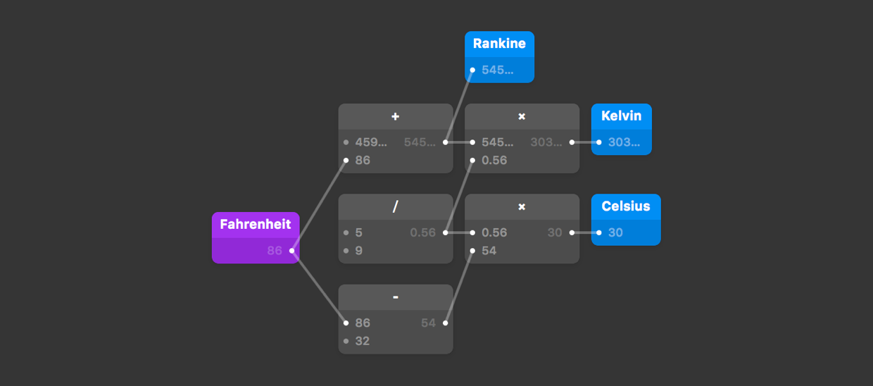
It would also be cool to add visuals in the modeler like this:
http://origami.design/tutorials/getting-started/Coming-From-Code.html
Awesome! Where is the “Celebrate” button next to the Vote Button?
Finally the moment is there: Dark Mode, Widget updates and Data Hub improvements - Mendix 9.11
https://docs.mendix.com/refguide/preferences-dialog#dark-mode
We definitely need this!
Indeed, a dark theme will be great improvement for the platform.
up ! what is the latest news about dark mode theme?
I hope in the next Mendix World we going to get good news about that. Please, this is really necessary.
“On the flip side, long-term reading in light mode may be associated with myopia.”
https://www.nngroup.com/articles/dark-mode/
It’s not so black and white. ;-D
In fact, depending on how you use your device, each mode has its own advantages.
I think the dark-mode should be an option in Studio Pro.
It's crazy how many votes this has gotten.
According to a huge study done by the NN Group:
”In people with normal vision (or corrected-to-normal vision), visual performance tends to be better with light mode...”
https://www.nngroup.com/articles/dark-mode/
just thought might be nice to share this study :D see what you guys think :D
🤔 I hope this important point becames active real soon.
vscode would be an excellent reference
Message from Mendix.
Survey: Studio Pro visual design
In addition to the live sessions mentioned on slack, we want to make it possible for everyone in the community to provide us with feedback. It would be great if you could complete a quick survey — it will take you 5-10 minutes. Thanks for your help! Visual design (look&feel) aims to improve the aesthetic appeal and usability of Studio Pro with suitable icons, typography, space, layout and color.
Thanks on behalf of our design team!
@Andrej :-D
Mendix wake up, don’t let Outsystems beat you because of dark mode
Could we get an update on when this feature is planned to be worked on?
I’m having trouble using Mendix Studio Pro for longer than small periods of time, primarily because of eye strain.
Having extensions into the modeler would make this possible...
Any updates on the Studio Pro dark mode? It would be so much easier on eyes to have the dark mode while creating microflows or anything else.
The dark theme/mode for Mendix Studio Pro is being developed by Mendix. However it seems to be part of a bigger change that replaces the current way the Studio Pro UI in total is build. There is still no ETA from what i know.
I think Mendix is the only app left on my machine that doesn’t have a dark theme. Dark mode is so easy on the eyes, and seeing how most of my time is spent staring at Mendix, this would be amazing.
Hoping we see this, or at least get an ETA, soon!
Good to see this idea is planned. On behalf of my eyes: thanks.
Do we need more upvotes on this one?
@Robert I can tell you it is not in the 7.19 :(
Is there an update?
Community is crying for this feature, and you have it on backlog without a concrete time line ? What should we do to get a deadline...collect signatures or so or start a petition on change.org?
Can we have an update on progress of the development of the dark theme?
@Tim van Steenbergen: are you still using a CRT? Because with LCD monitors, black actually uses slightly more power. Unless you work on a TV with adaptive backlight, but I doubt you do.
Yes, and for starters lets make the online space available in a dark theme too!
Same here. And it is environmental friendly! It actually uses less power.
Absolutely! At this moment i have put my screen to a lower brightness, but this is not at all the best option when using other programs. A dark theme would be very much appreciated!
