Mendix Time Series Widget Consuming Rest Service always a Vertical Straight Line
Hi Aniketh,
You need to feed your chart the entire list of entries you wish to display, so have your microflow return a list containing all measurements. Your service returns multiple objects right? Just convert (if necessary) and return these objects.
Good luck!
Dear Aniketh,
Not sure, what is causing the issue on your chart. Did you try out the how to? There is one on a direct REST https://docs.mendix.com/howto/front-end/charts-basic-rest But not sure if you need that.
You can also have a look at the mendix development TestProject.mpk found in the release files of the repo It contains many example how to implement the charts
https://github.com/mendixlabs/charts/releases
Cheers, Andries
Hi Aniketh, the two X values shown in your variables have the exact same date and time, so that (perhaps) explains the single data point on your x axis. If you need old consumed data in the chart you need to have it persisted and use database as datasource. I think the consumed data holds data for multiple windmills at 1 moment in time, if that's the case you can create multiple series for each of the objects returned by each rest call.
Hello Everyone,
Thank you so much for your inputs and solutions. I was able to figure out my problem from your inputs.
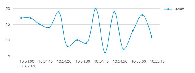
I had a Date and Time field on X-axis. But Plot.ly JS by default considers x-axis as Date. Since all my values from REST service were from the same DATE but different time (with a 5 to 30 second difference between each row), I was getting a straight line.
I had to format the Time series chart using Advanced Layout properties saying X-axis format type is ‘time’ instead of the default ‘date’. Now my Time series chart is appearing fine.

As you can see now only Time is being shown in X-axis instead of both date and time.
I had to go through plot.ly JS reference document to find this clue but got it solved in the end.
The problem of refreshing the entire graph is still present and the graph is still not storing values from the previous REST call and new values get plotted on the entire graph. But that is something I can solve by modifying my microflow. I will work on it and post if I can figure it out.
Cheers and Thanks to all who responded guys.
Aniketh