How to create a side modal?
As far as I know, Mendix does not provide an out-of-the-box side modal component. However, as a simple workaround, you can achieve this behavior using a normal modal page and a small amount of custom CSS.
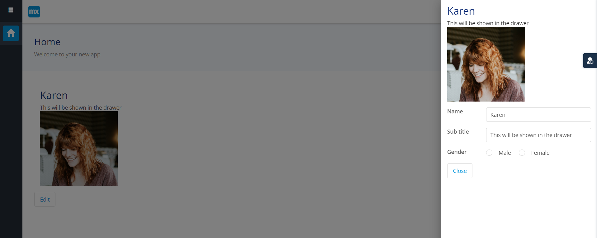
First, create the page that will act as the side modal. This is a standard Mendix page (for example a Data View or detail page). Set the page type to Content. Place all widgets inside a Container or Layout Grid and give that container a class name such as side-modal. This class will be used to control the positioning.
Next, open this page as a modal. From a button or action, use “Show page” and enable “Open as modal dialog”. At this stage, it will still appear as a regular popup, which is expected.
Then, add custom CSS. In Studio Pro, go to App Explorer, open the theme folder, then web. If there is no custom.scss file, create one. This file is used for custom styling across the app. Add the following CSS:
.side-modal {
position: absolute; /* Keeps Mendix modal behavior intact */
right: 0; /* Aligns the popup to the right side */
margin-right: 0; /* Removes horizontal centering */
width: 420px; /* Width of the side modal */
}
.mx-window {
margin-left: auto; /* Pushes the popup to the right */
margin-right: 0; /* Prevents centering */
}
Hopefully this would help you.